Cycle: Frontier
Company: Yager
Position: UI / UX Designer
Duration: 2021
Engine: Unreal Engine 4
Status: Released
GOAL DEFINITION
When the original Cycle underwent a pivot to transition into a slower, more hardcore extraction shooter - accordingly the UI would get an overhaul and a new art style treatment to reflect this change in tone and direction.
The original UI style was colorful and flat, with predominantly white text on blue backgrounds.
To achieve a pivot into a more "hardcore" direction, the UI & UX Designers at that time were given the task to explore a new direction for the UI.
Partially it should also cover a possible addition of gamepad accessibility as there were plans for Cycle to also release on the current generation of consoles.
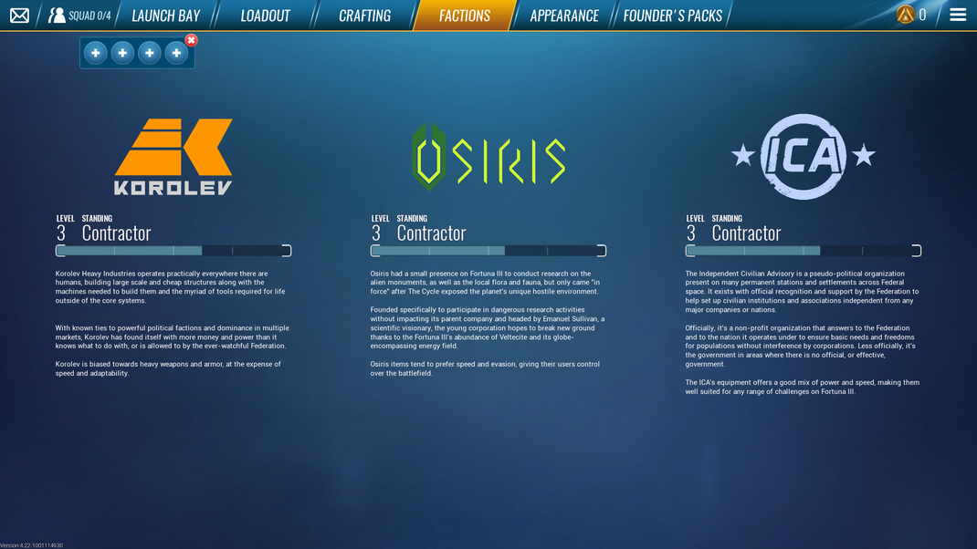
Original faction screen
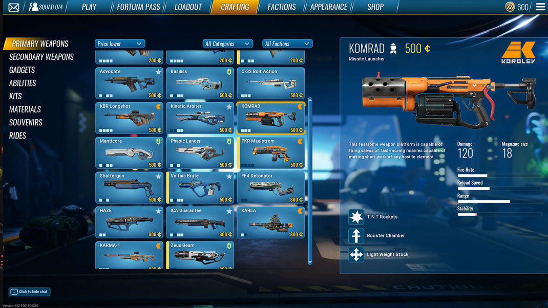
Original crafting screen
The goal:
- combine the progression of the individual factions with the weapon/item crafting
- reduce the amount of on-screen information to allow readability when sitting further away from the screen
Research
I start of by gathering a lot of competitor examples to understand the established conventions before trying my hand at solving the problem
Looking at competitor examples prove itself to be a huge benefit as it provides me with an insight into what works and what doesn't.

EXPLORATION
After getting a good idea of conventions & pitfalls, I've started to compose a lo-fi wireframe to establish all needed elements in the composition.
This usually ends up with several quick variants that I can quickly move around and re-shuffle to find a good composition that works.
Previously the factions screen only showed the faction progress while the actual unlocks were shown in the crafting screen. This felt disconnected and the crafting will now happen in the context of each faction.
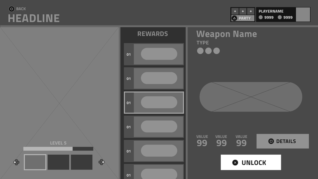

After I was happy with the general composition I've used the available art assets to deliver a first look of the direction it will take.
As the gamedesign of this feature was still in flux, I've focused on the visual aspect, not caring as much about the design contrains as the goalwas to find a new UI direction.
With this composition you would directly see the faction progress with all the crafting unlocks.

The stacked information in the left-side panel felt too crammed.
I split up the faction selection from the current faction progress and moved them into tabs on the top instead.
More information and colors are added to the selected weapon.
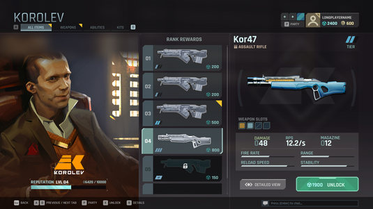
Additional information and progress bars are added to offer more meaningful information at a glance of the selected weapon.
Additional information and states are added to the ranks reward list items.
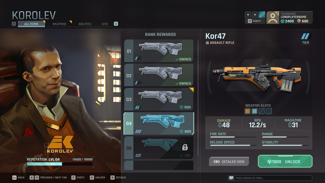
Since a console port was considered for The Cycle, I've made a variation with gamepad inputs and ensured the screen is functional via indirect inputs. At this stage it was unclear if we would go for a Destiny-style cursor selection.
Implementation
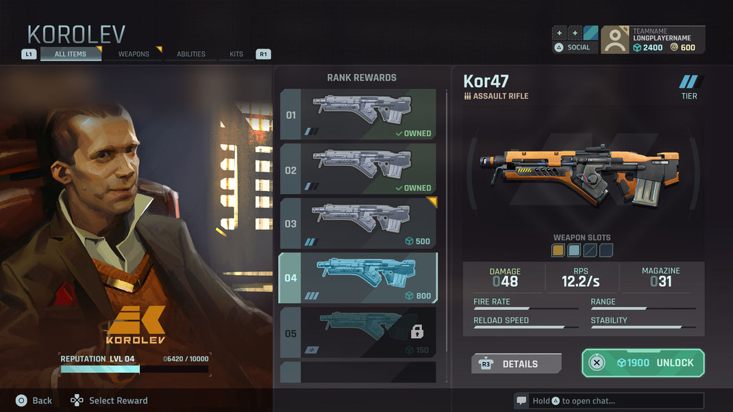
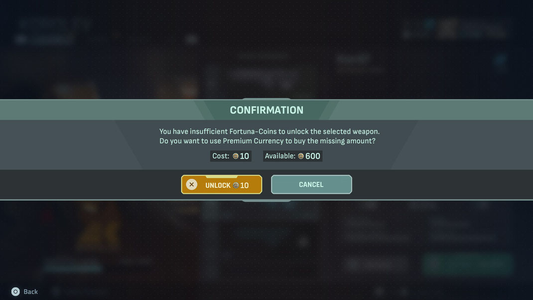
Eventually the visual exploration served as the base for the new UI art direction and a more fleshed out iteration made it into the final implementation of the game.
Some screenshots of the results after The Cycle UI team had a go at it: