

XCOM: Legends
Company: Chimera / 2K Mobile
Position: Lead UI / UX Designer
Duration: January 2021 - July 2023
Engine: Unity 3D
Status: Soft Launch
I've joined Chimera in January 2021 with the goal to build up a company-wide UI/UX department for all existing and upcoming games.
With XCOM Legends in production for over a year, I had to hit the ground running as Soft Launch was imminent.
User Experience
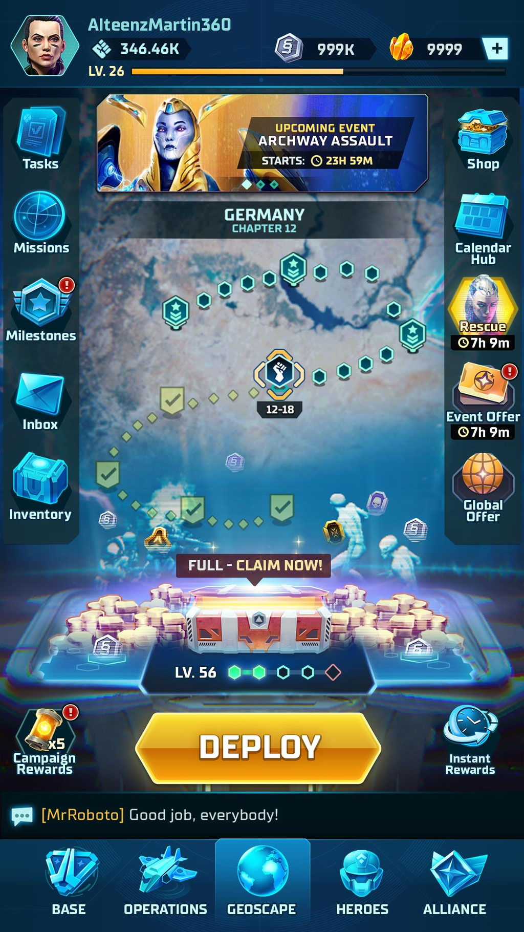
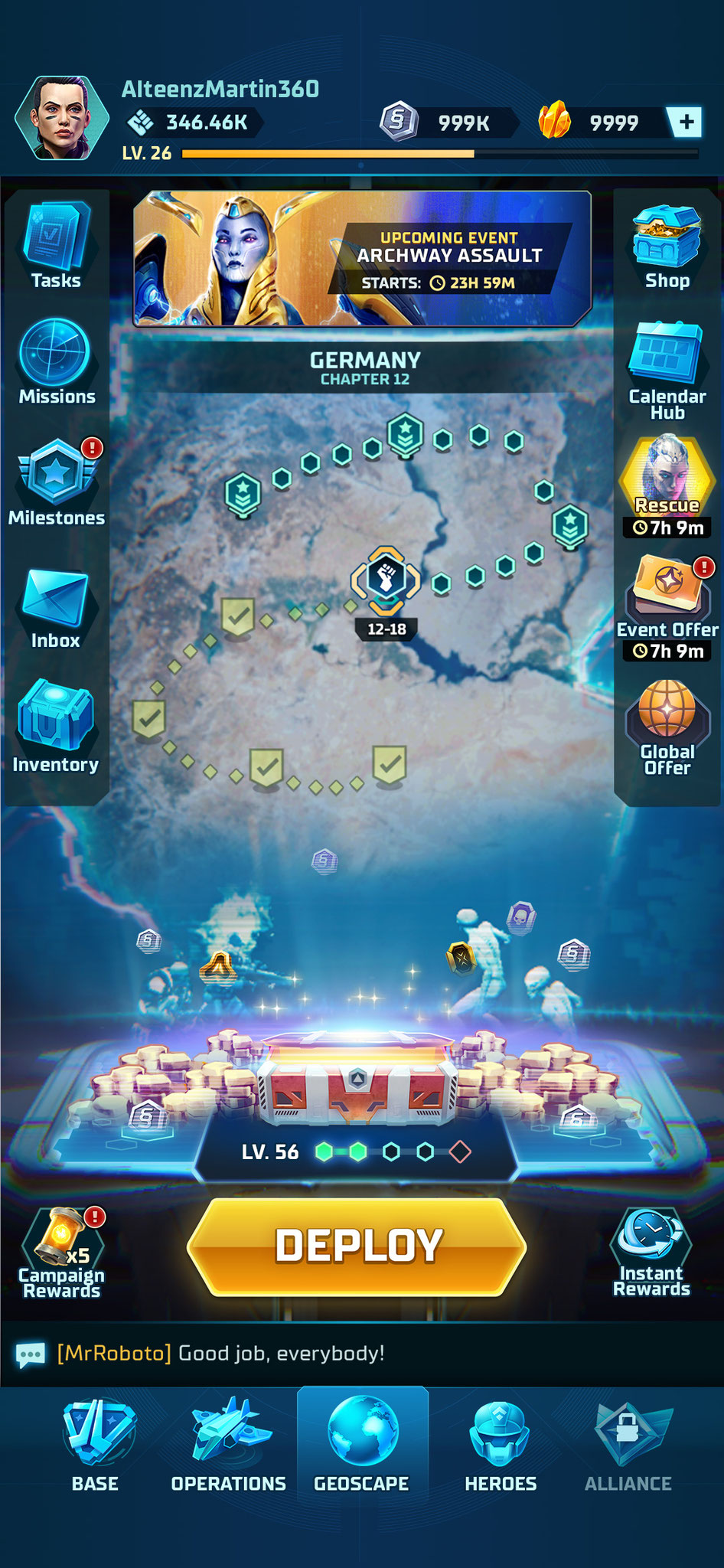
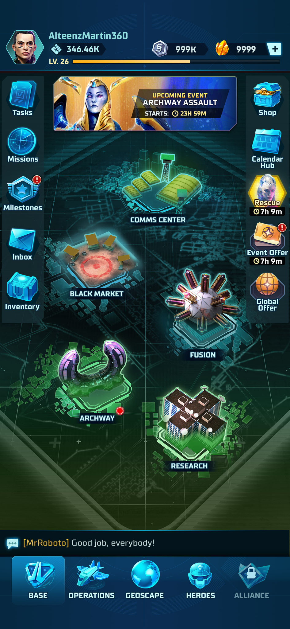
A feature heavy game required a lot of wireframing and high-level coordination with game designers to ensure players could easily interact with all aspects the game.
For a rapid iteration process, low fidelity wireframes were created during the collaboration with game designers and product to find an early agreement on the contents of each screen and feature.


Left: low-fidelity wireframe with states, Right: high-fidelity UI mockup

Left: low-fidelity wireframe, Right: high-fidelity UI mockup
The existing UI structure was unconventional and grew organically over the duration of the development.
This brought the issue that as a user it was difficult to build a mental model of the product, where to find features and how they related to each other.
To solve this situation, the existing state of the information architecture was evaluated to see the specific issues it has.
Afterwards, different approaches of our competitors were collected to see which approach would work best for our product.
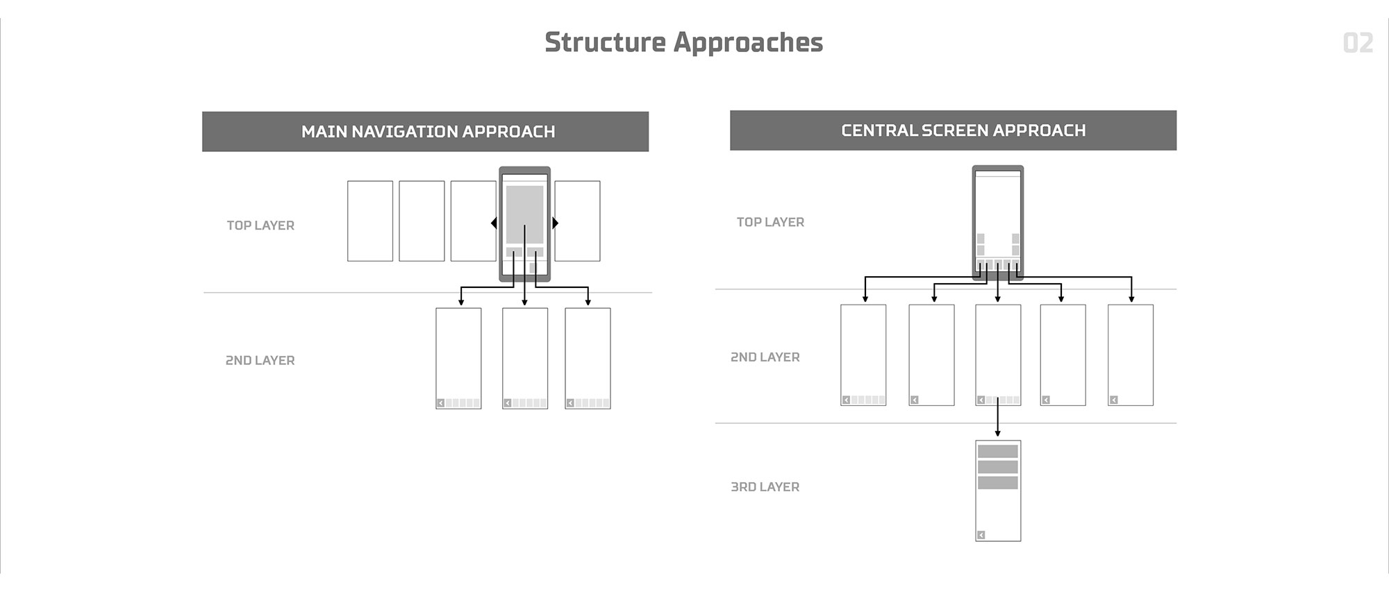

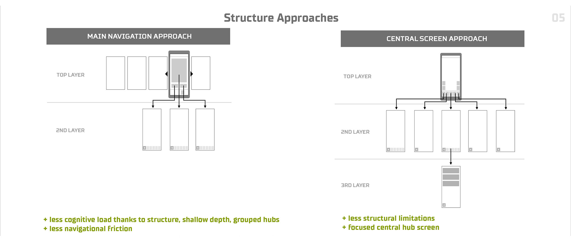
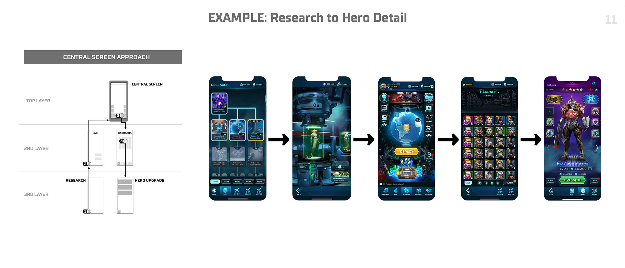
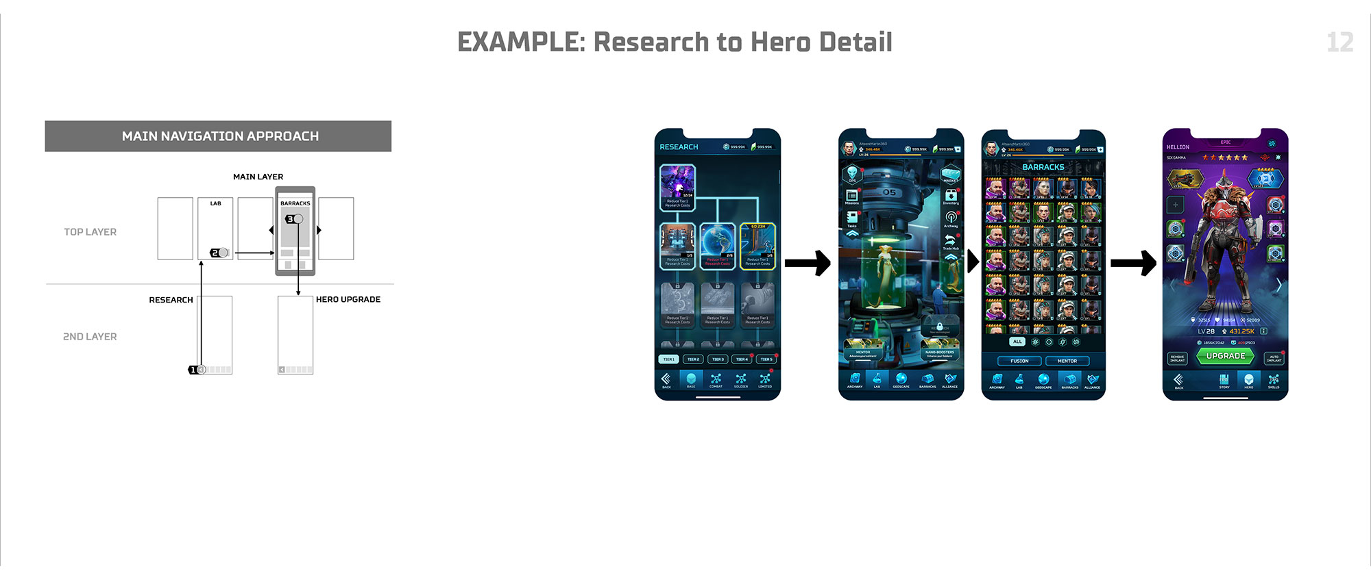

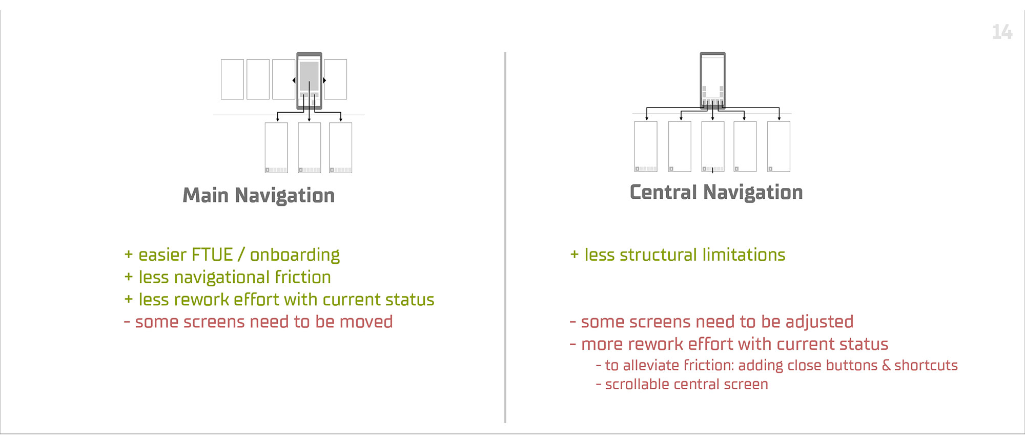
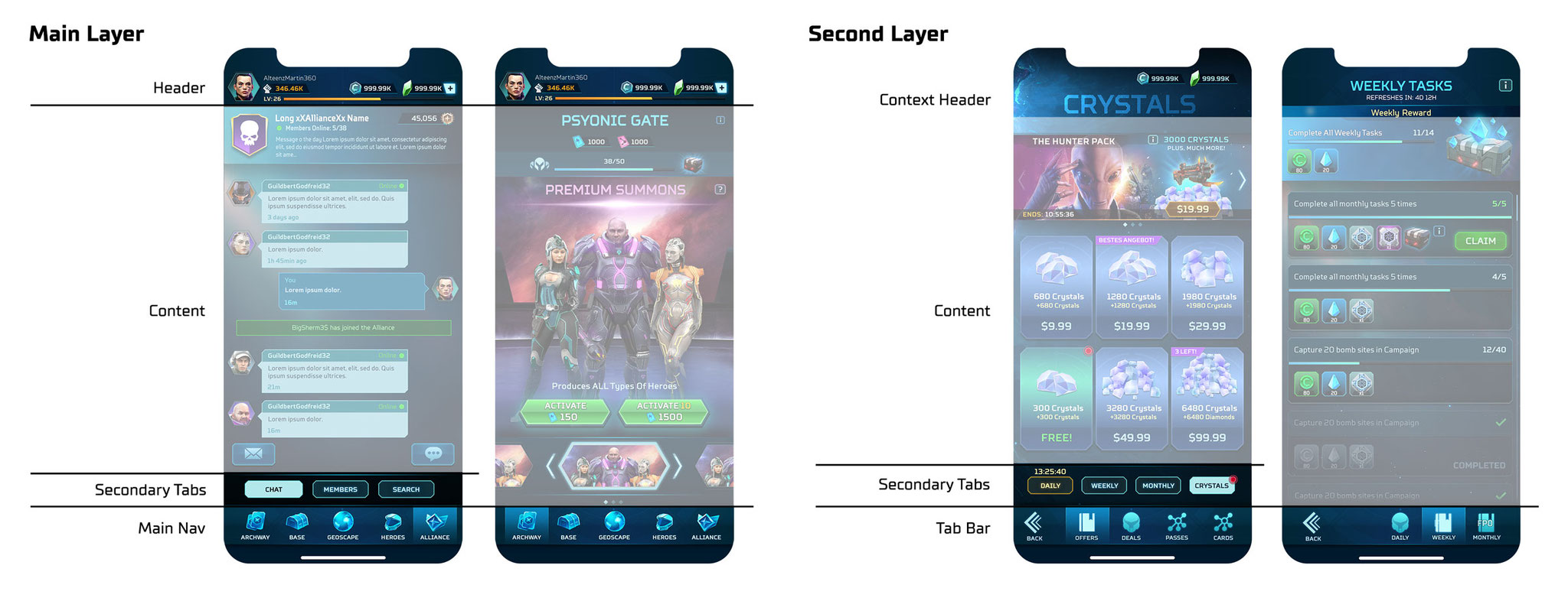
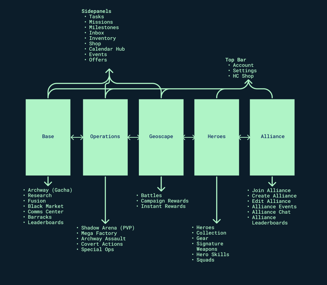


Structure Evaluation & Iteration
Setting up a more conventional, readable structure was a first step to allow for better user experience.
We've settled for a multi-hierarchy setup with a primary layer, secondary layer and modals.

UI Style
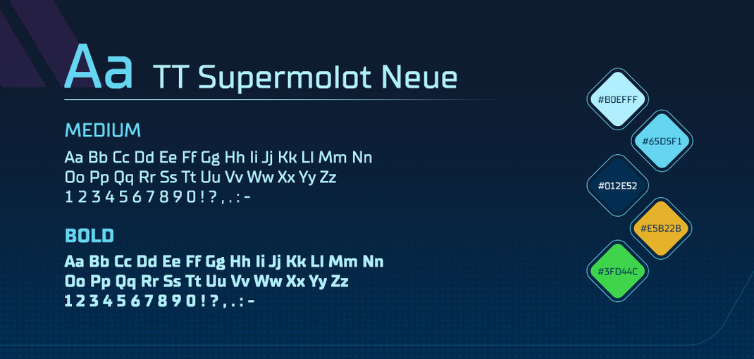
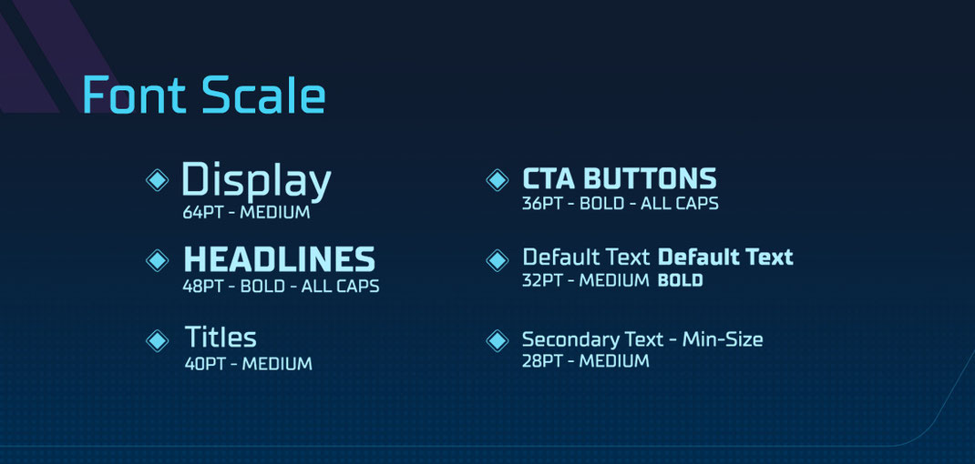
TYPEFACE
Finding the right font that matches the style and feel of the UI is a crucial task.
An extensive exploration began where I've scouted and selected various typefaces that might match our game style.
The typefaces were placed in our existing mockups to see how they perform in our diverse contexts.
This excercise quickly brings up readability or style issues that would otherwise be hard to evaluate. Additionally, the typeface mockups can be used to gather quantifable user feedback by showing them in comparison.
After multiple rounds of evaluation and stakeholder approval, I went with TTSupermolotNeue as it felt both futuristic and clean without feeling too mechanical - something that other geometric fonts tend to do.
ICONS & ELEMENTS
With increasing complexity more and more icons had to be created to allow players to quickly parse onscreen information.
In most cases the icons had to both function in smaller sizes, grouped with other icons as well as work well in big, illustrative scale.
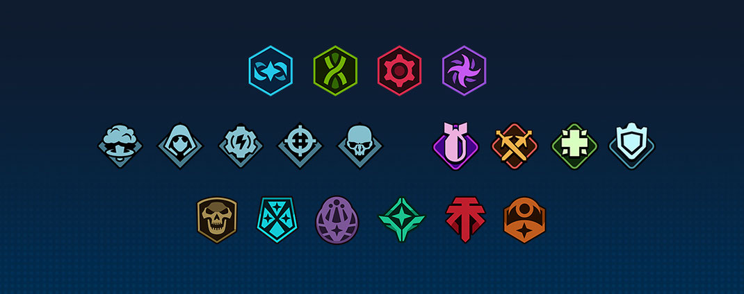
Faction and Class icons from the original XCOM-series had to be re-envisioned as readability on small scales as well as differentiation was not working well in the needed contexts.
I've went over the icons and simplified them so they work well both in bigger sizes as well in tiny sizes.
The color range was redefined so each faction could be read by color only.

Top: Original faction icons, Bottom: Simplified faction icons
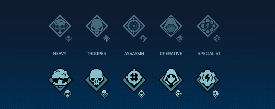
Top: Original class icons, Bottom: Simplified class icons
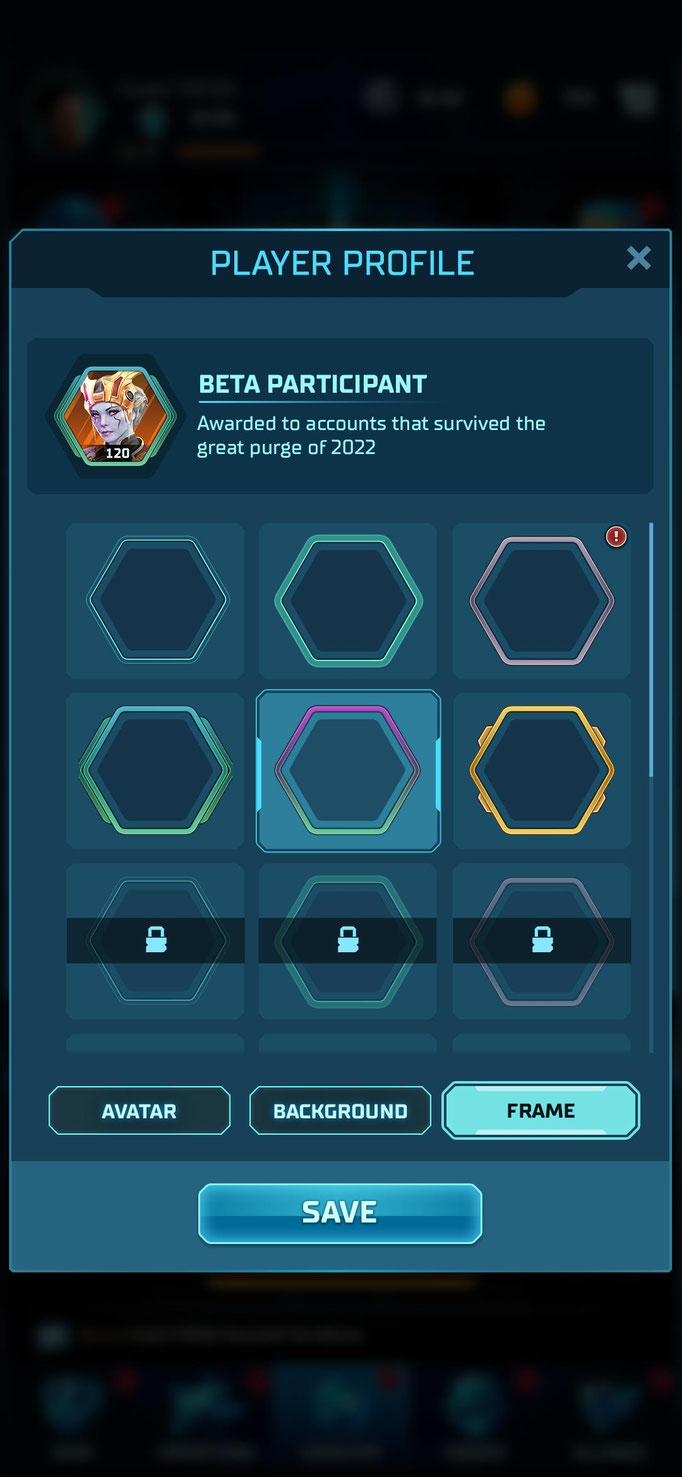
Customizable avatar frames
Collection of hero kit icons
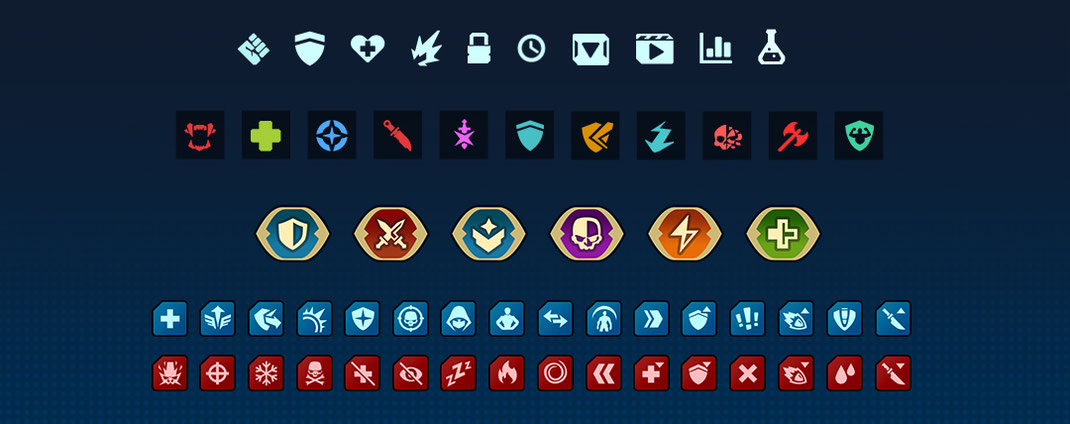
Stats, sets, leader auras, buffs, debuff icons
Skill rank icons
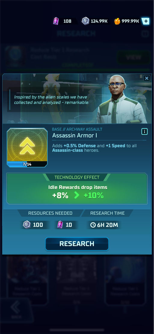
Research category icons
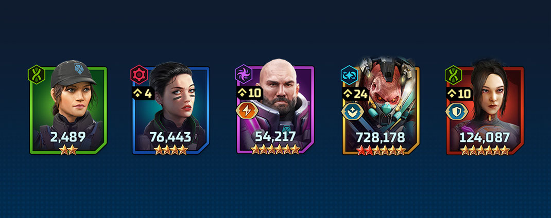
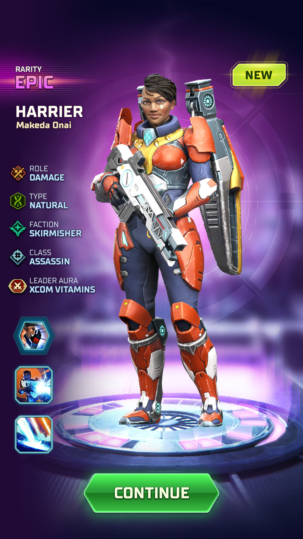
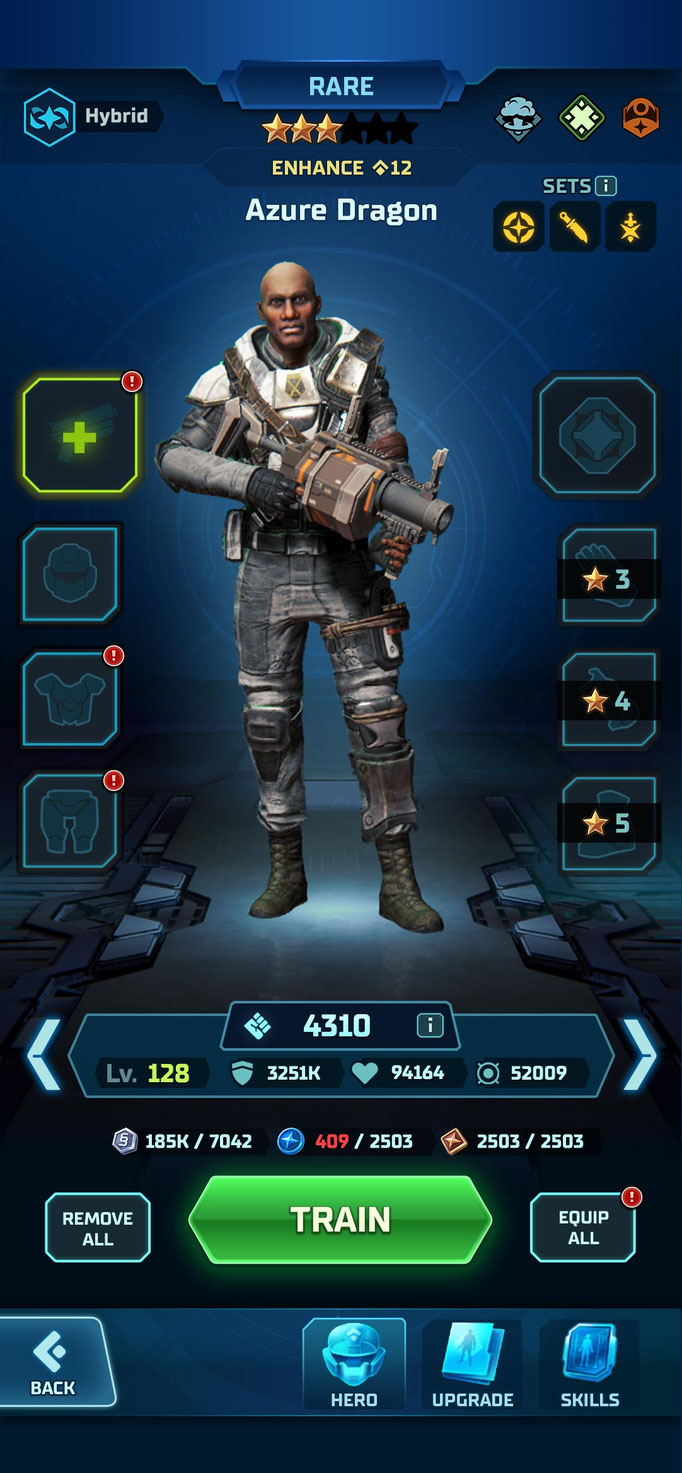
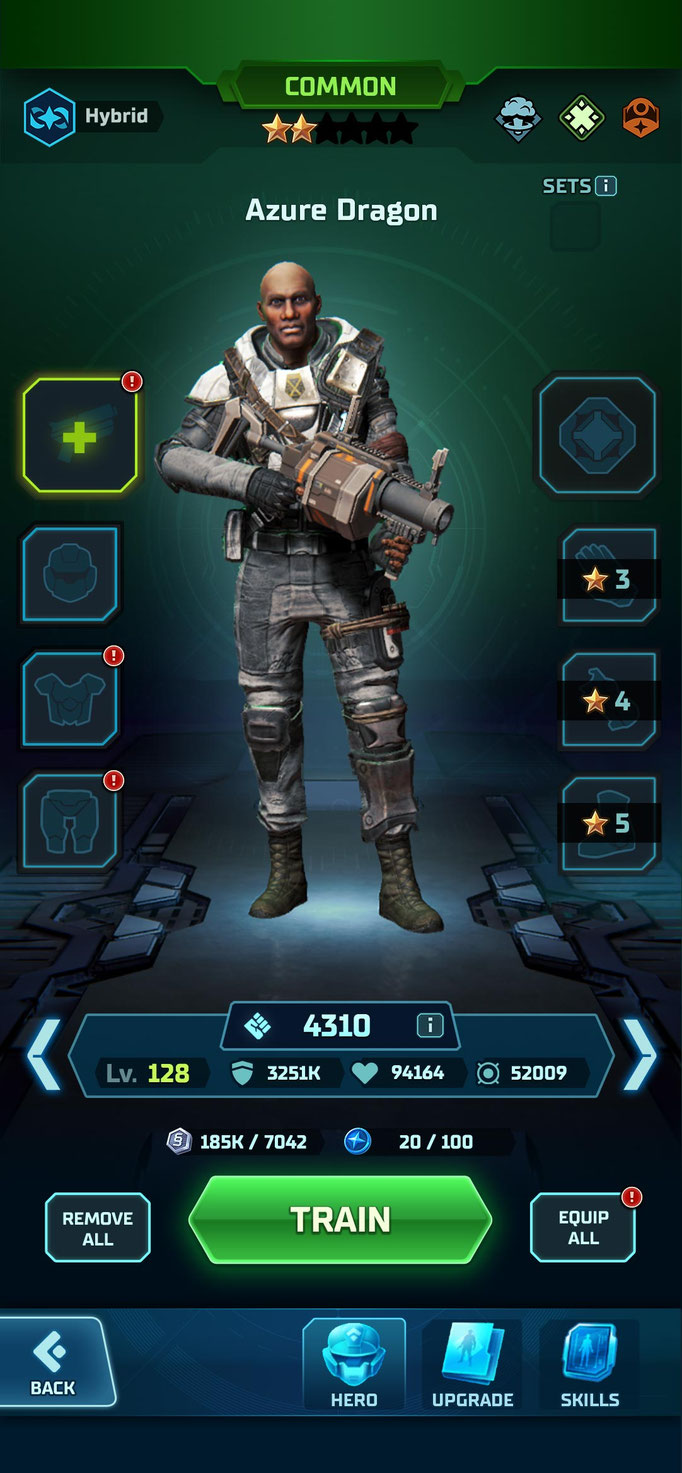
Hero rarity types
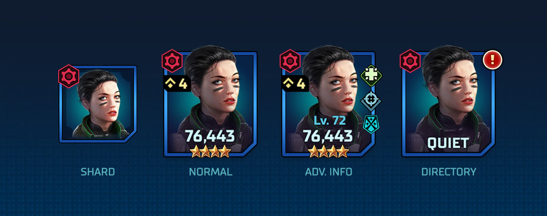
Hero portrait variants for different contexts
Icon usage example

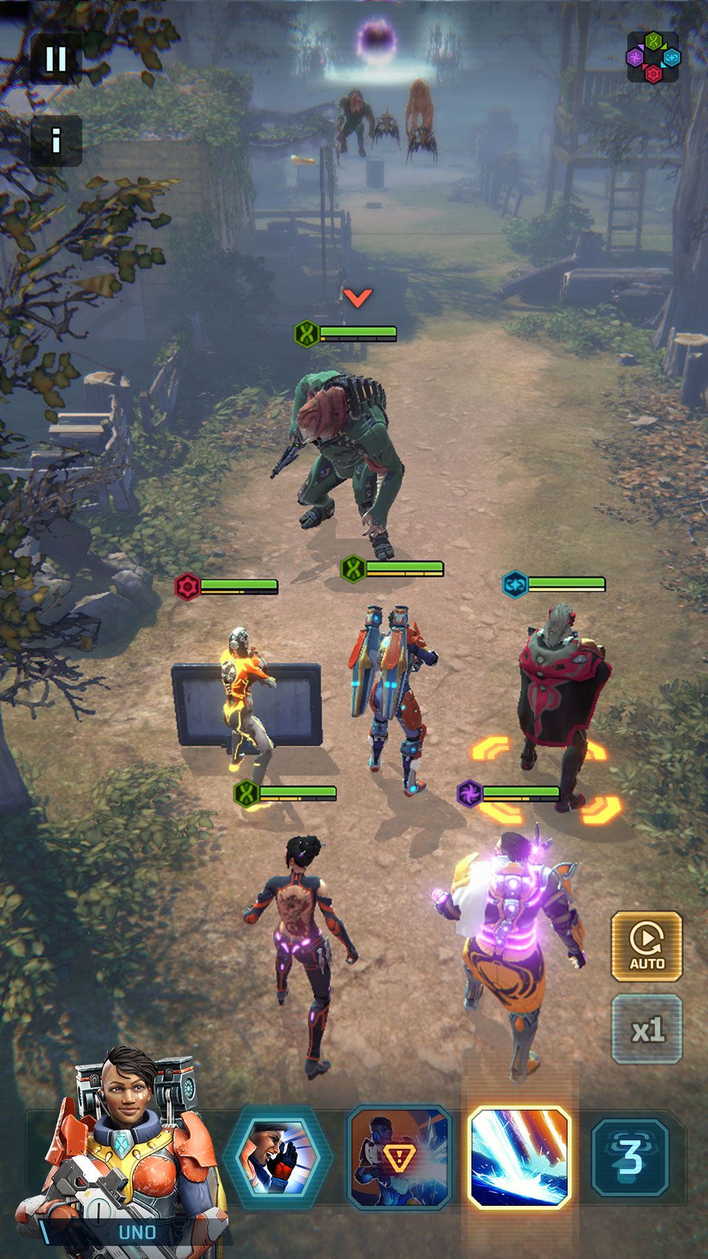
motion design
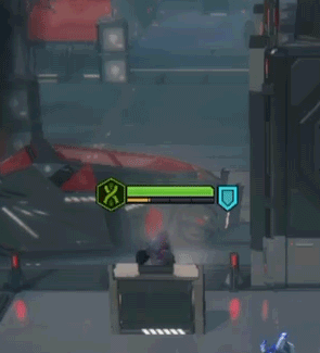

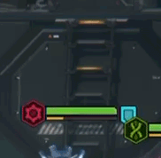
Damage Indicator Feedback: green - high damage, yellow mid damage, red low damage
Damage indicator and hit chance
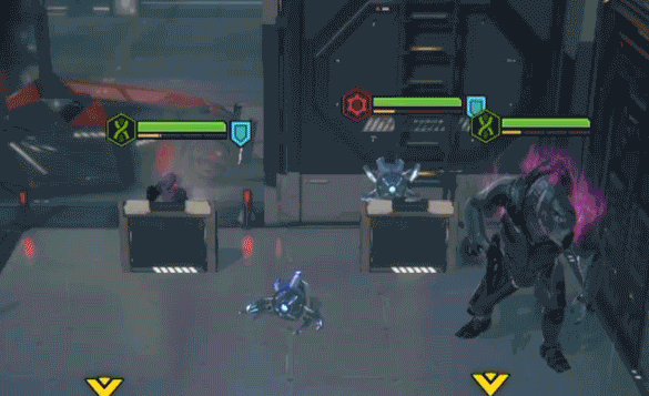
Variety of feedback animations
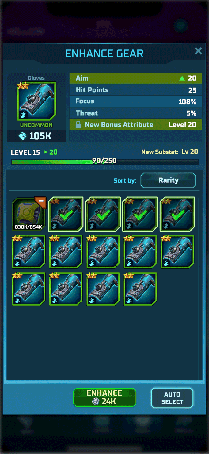

Left: Gear enhance, Middle: Icon floating label, Right: Hero fusion

The Combat Kill feedback animation was added to make neutralizing an enemy more rewarding and increase the readability of this event when playing on x2 or x3 speed.
The first version (left) was longer and had a lot of effects but once implemented it proved too be too noisy and long - so it was changed to a shorter, subtler version.

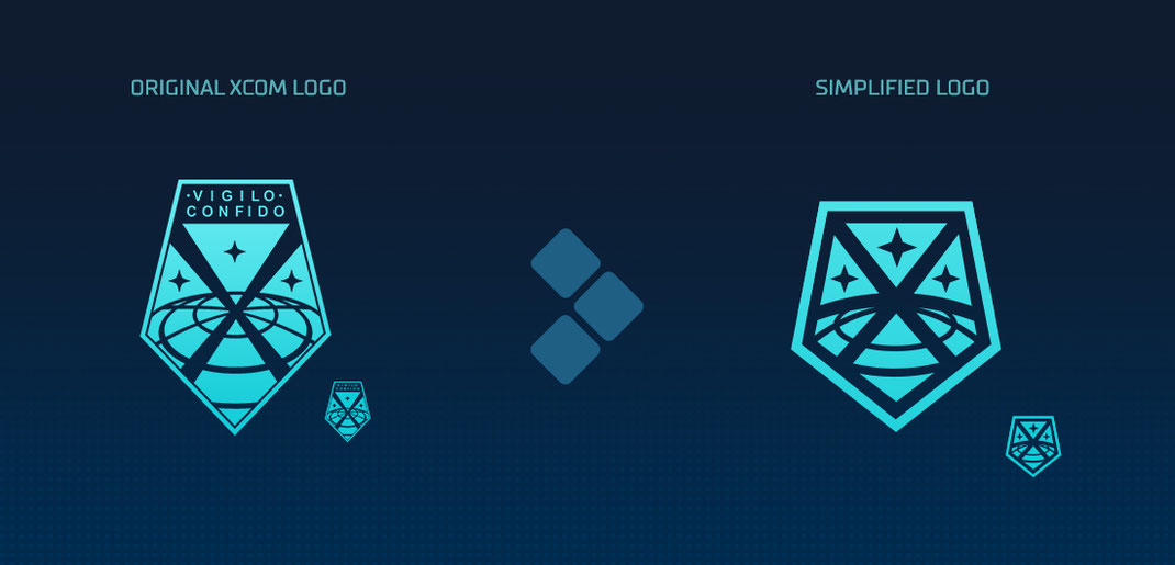
The original XCOM logo is hard to read and utilize in mobile context. Additionally, the project needed to feel unique and like a progression fromt he original game series.
To enhance the brand identity, I've created a simplified version of the original XCOM Logo that improves on being readable on small scales while maintaining the key elements that made the original logo so memorable.
With this we could replace our generic loading spinners with a more interesting, branded one.


The Completion and Progress Notifactions are a crucial Quality of Life addition that allows players to track their progress and have a contextual quick access point to their tasks - a highly requested feature.
Whenever a progress was made or a task completed, the widget would appear and both notify players of the progress and also allow for a quick access point as the element is interactive.
It proved to be both a little moment of celebration as well as an improvement to accessibility of certain features.
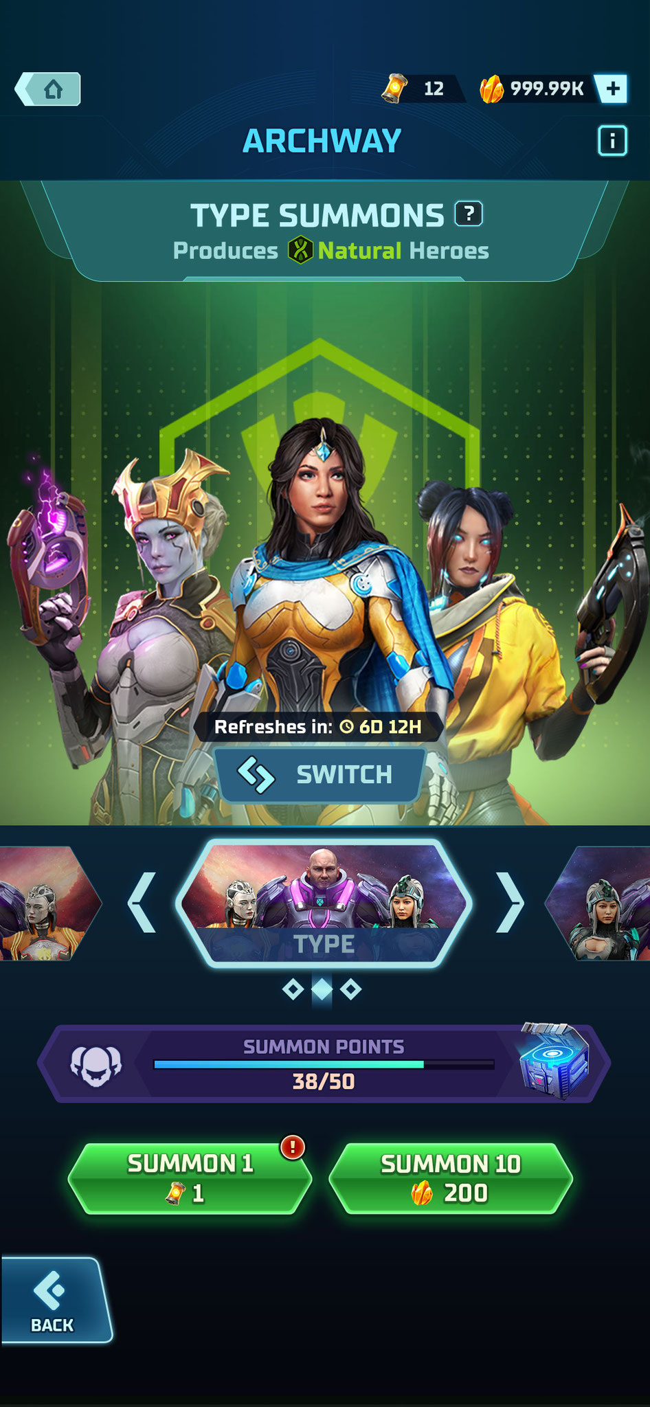
Gacha Hero Pull
We wanted something impactful for the gacha hero pull moment but back then, there was no context to how it would fit in the narrative.
I've set out to explore how we can use the Archway to deliver a flashy but understandable "pull moment" with the needed distinctions in reward rarity.
I've started by putting together storyboard of the main beats of the sequence so we can decide when the additional feedback and interactions would happen, including:
- "rarity hint" that shows players if there is a high rarity pull, e.g. a purple flash
- which beats can be skipped
- multi-pull extension when players go for x10 pull
- shortened duration for extended pull sessions
- hero detail reveal
- special hero animation
- rarity celebration moment that highlights rare pulls


Compositions
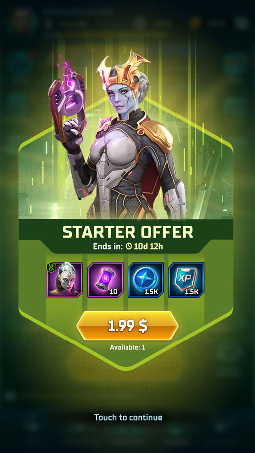
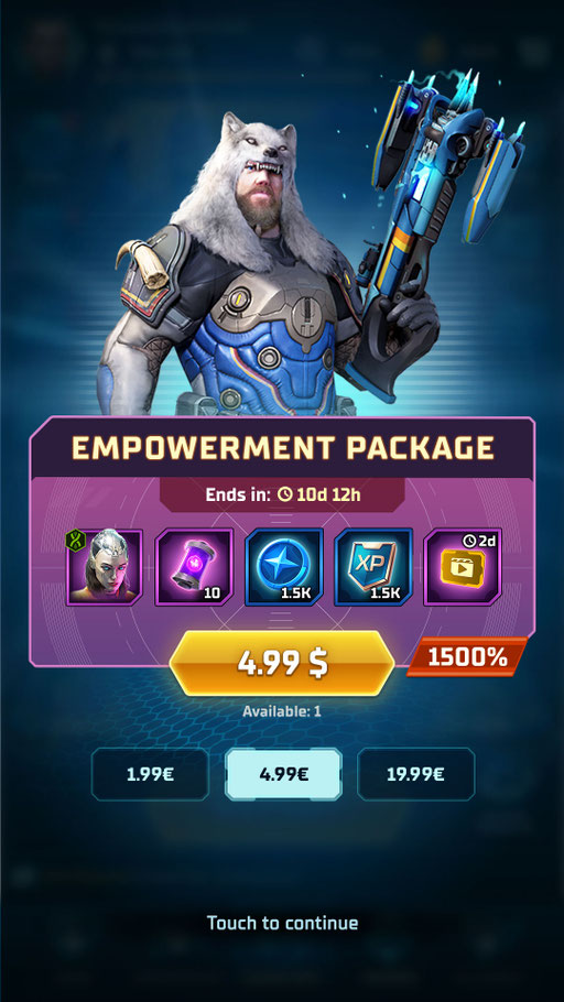
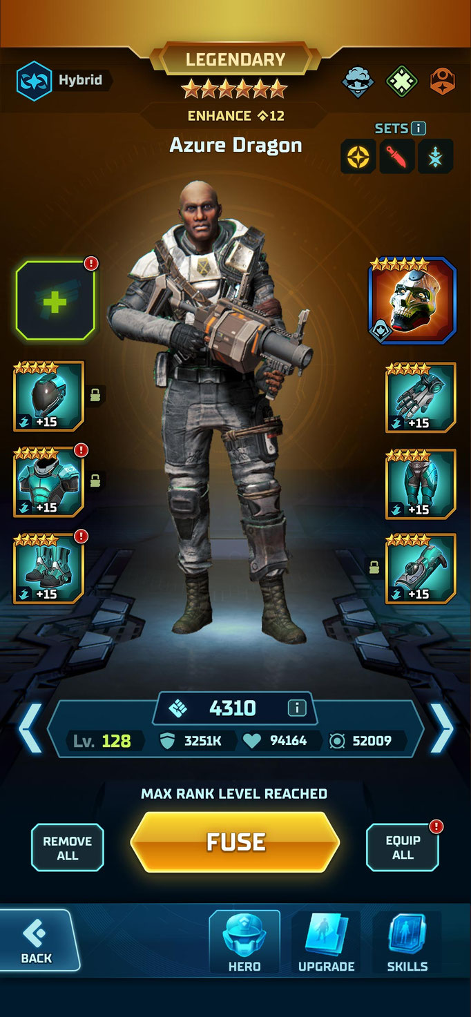
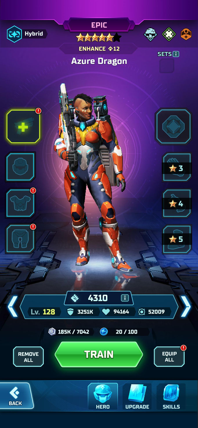
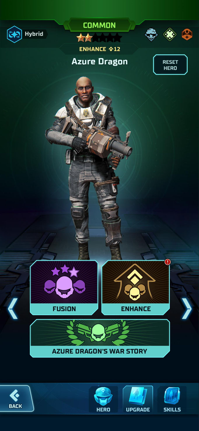
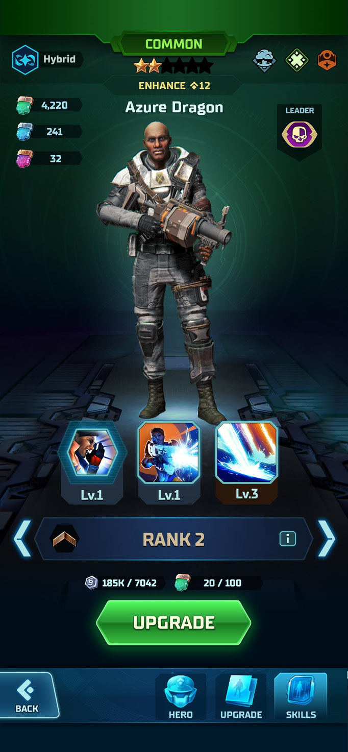
Plenty of screen compositions were created over the course of nearly three years.
First-Time User Experience (FTUE) Hero Selection
The Interstitial system can compose various interstitials with the same base framework

Hero Detail Rarity Variations
Hero Detail Sub-screens
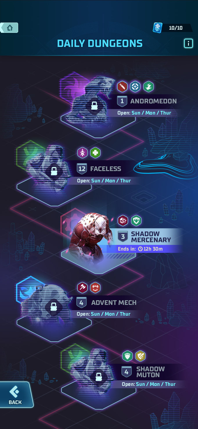
"Daily Dungeon"-feature


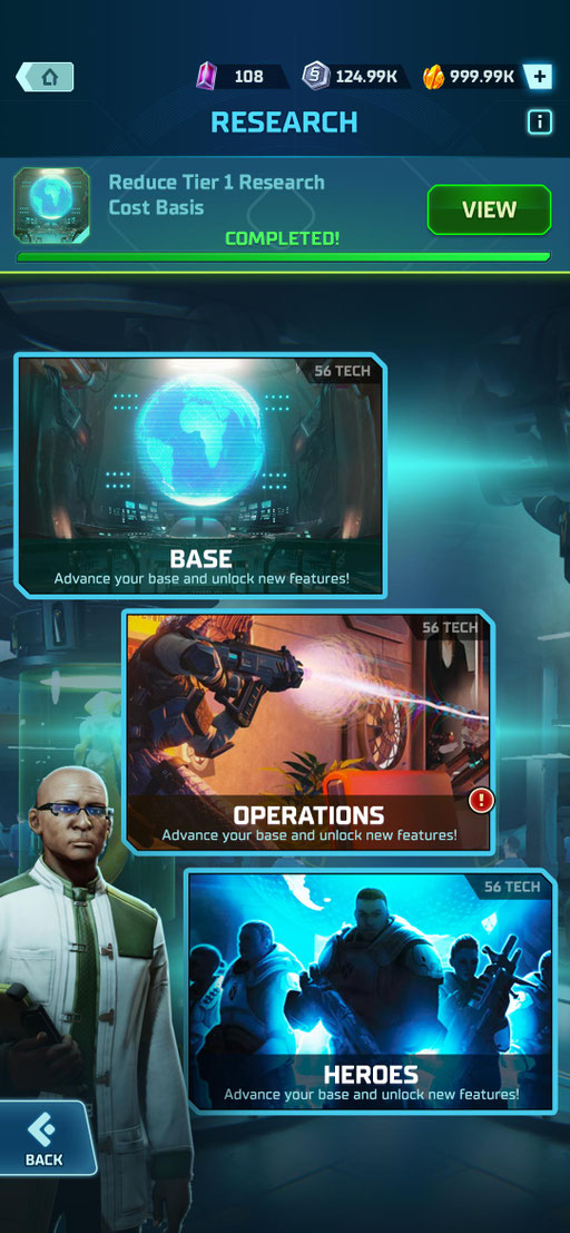
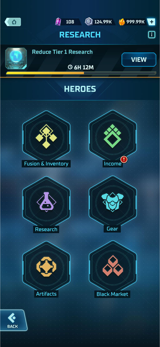
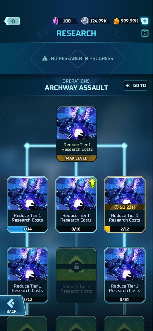
Various "Research"-layers
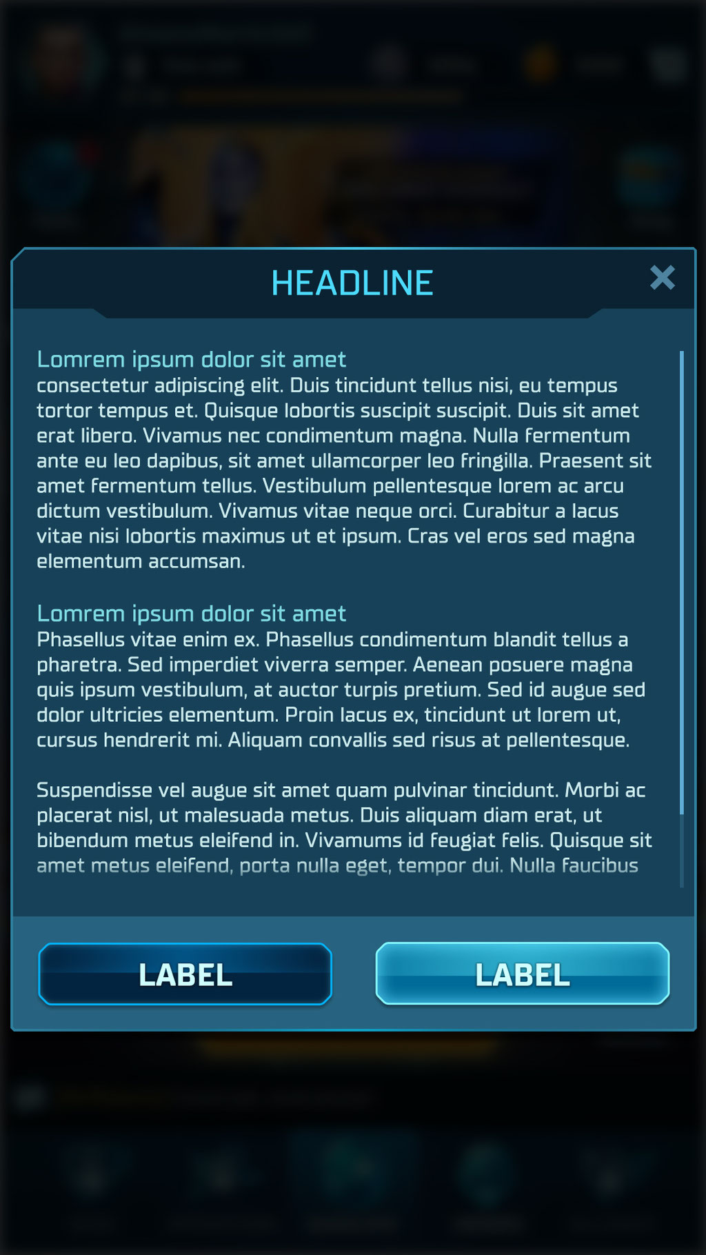
Various Modals
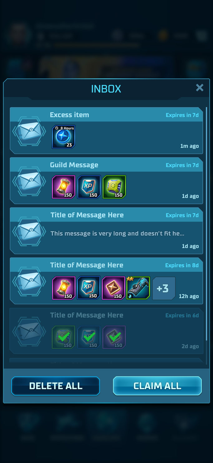
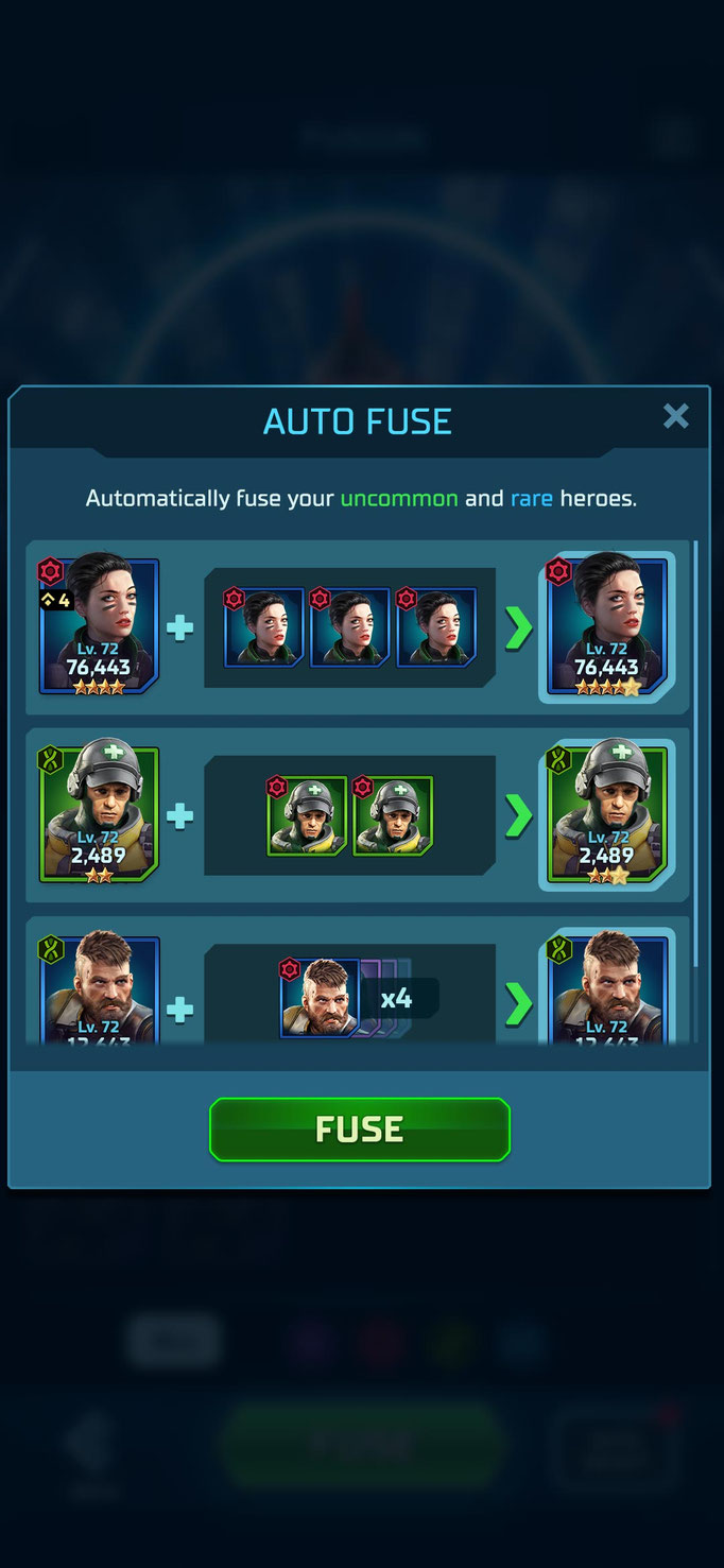
Modal System

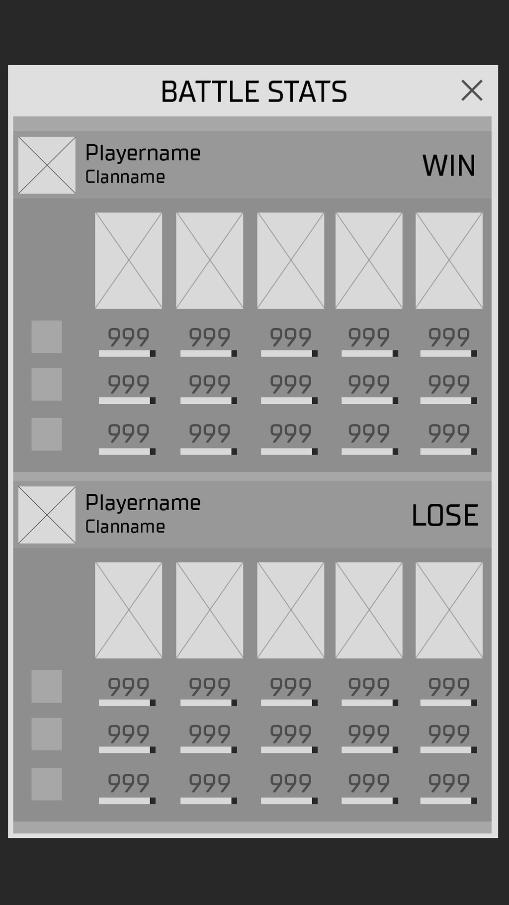
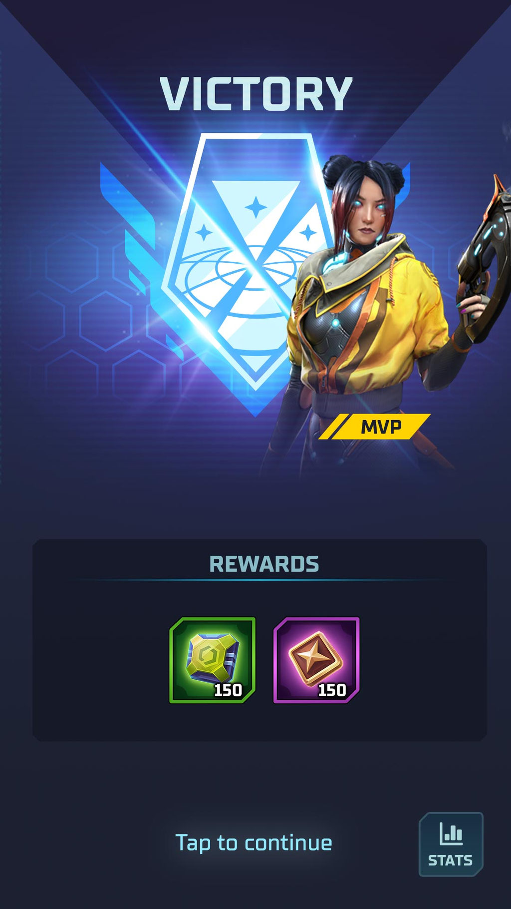
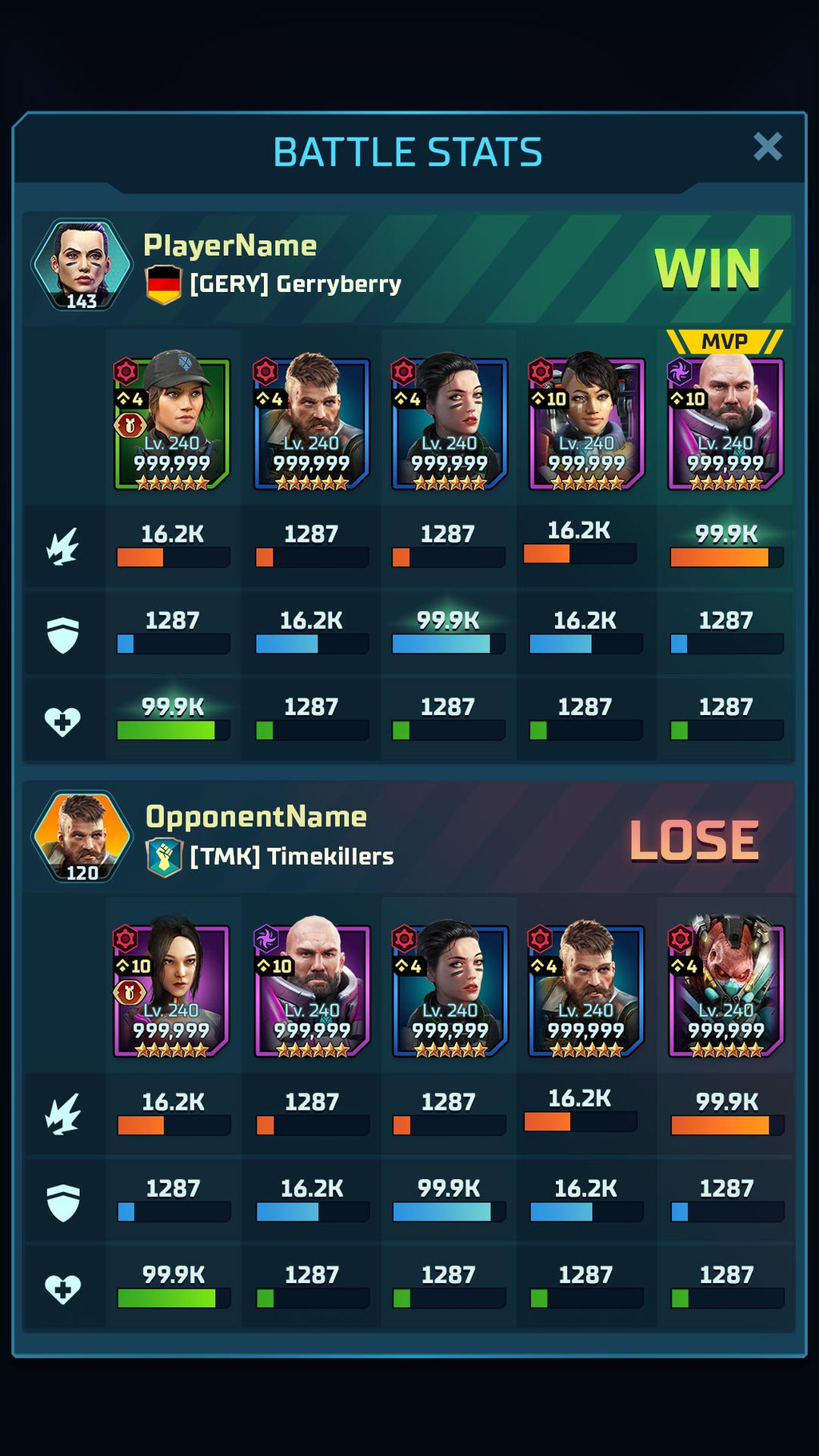
End of Match & Battle Stats
Gameplay Videos
Recordings of the live version
Game Intro (external link)
Onboarding Battle (external link)
Game Flow (external link)
A huge "Thank you!" goes to all the designers and artists that supported and collaborated with the UI/UX side of the project over the years
CHIMERA ENTERTAINMENT
Steve Haßenpflug (Lead Gamedesign)
Tom Fiedler (Head of Design)
Sabine Dorfner (UI/UX)
Segismundo Bragança (UI)
Martyna Noll (UI/UX)
Piotr Kubicki (UI)
Ana Giligan (UI/UX)
Bleda Tünay (UI/UX)
Viorica Pricope (UI/UX)
2K MOBILE & EXTERNAL
Om Tandon
Charles Hailstones
Brian Frederick
Jeremy Steiner
Junior Arce
Stephen Anadon
Let’s build something together.
If you’re navigating a project transition or need to scale a complex UI framework for a global audience, I’d love to chat about how my experience can help your team.
Thank you for reading!
Continue with my latest project:My Neighbor Alice