
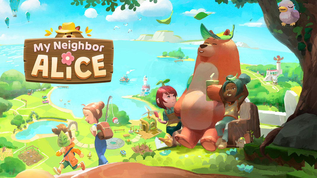
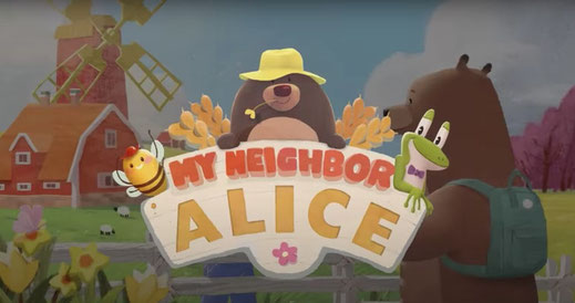
My Neighbor Alice
Position: Lead UI / UX Designer
Company:Chromaway
Tenure: 2024 - 2026
Team size: 30 - 70
Status: Released (over 100k players reached)
Engine: Unity3D
Platform: PC
Genre: MMO Social Game
Experience My Neighbor Alice on the web: www.myneighboralice.com
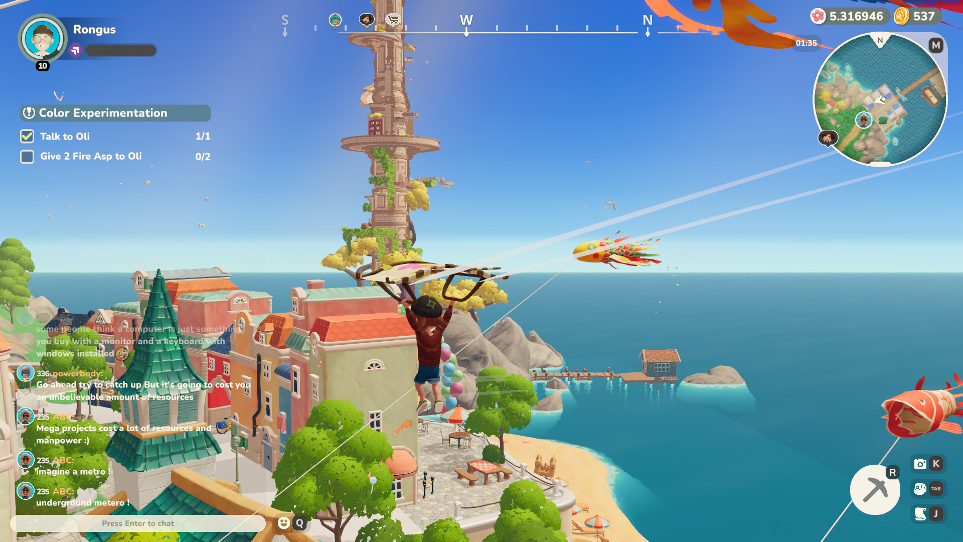
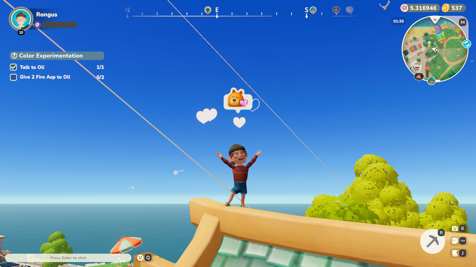
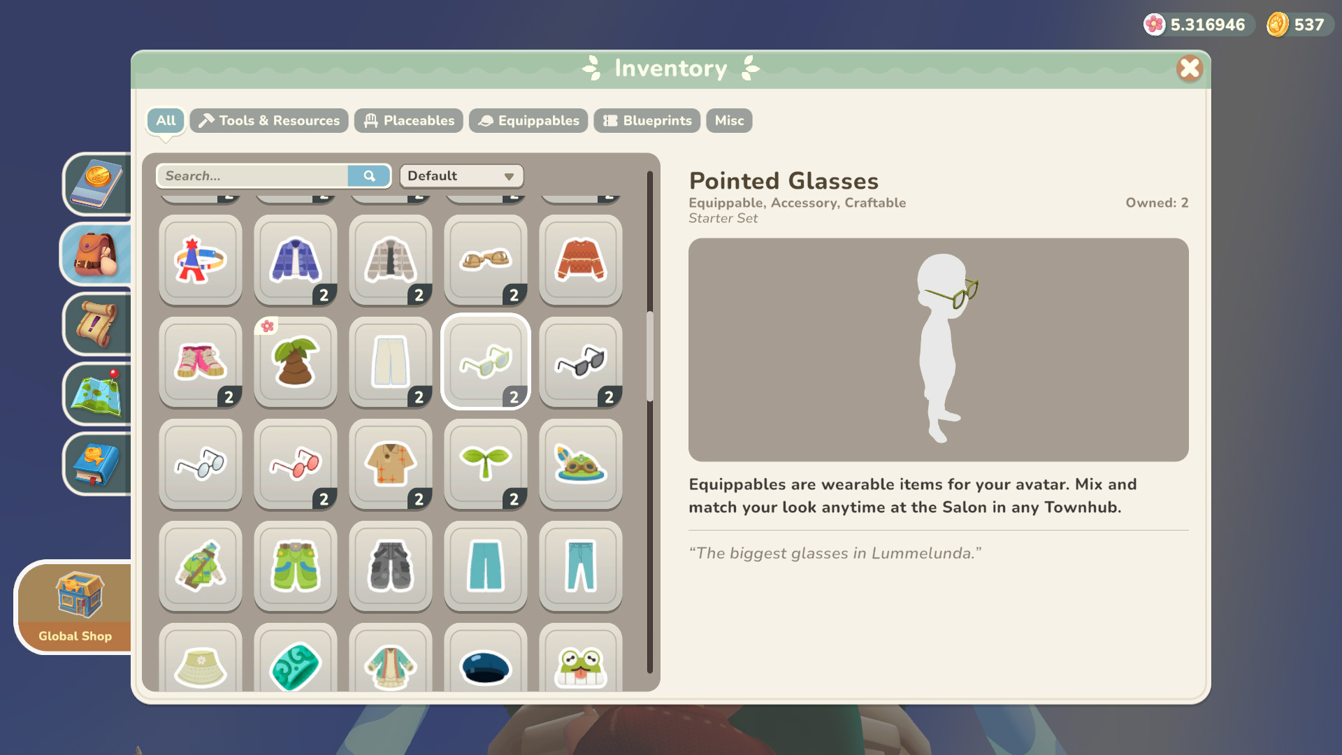

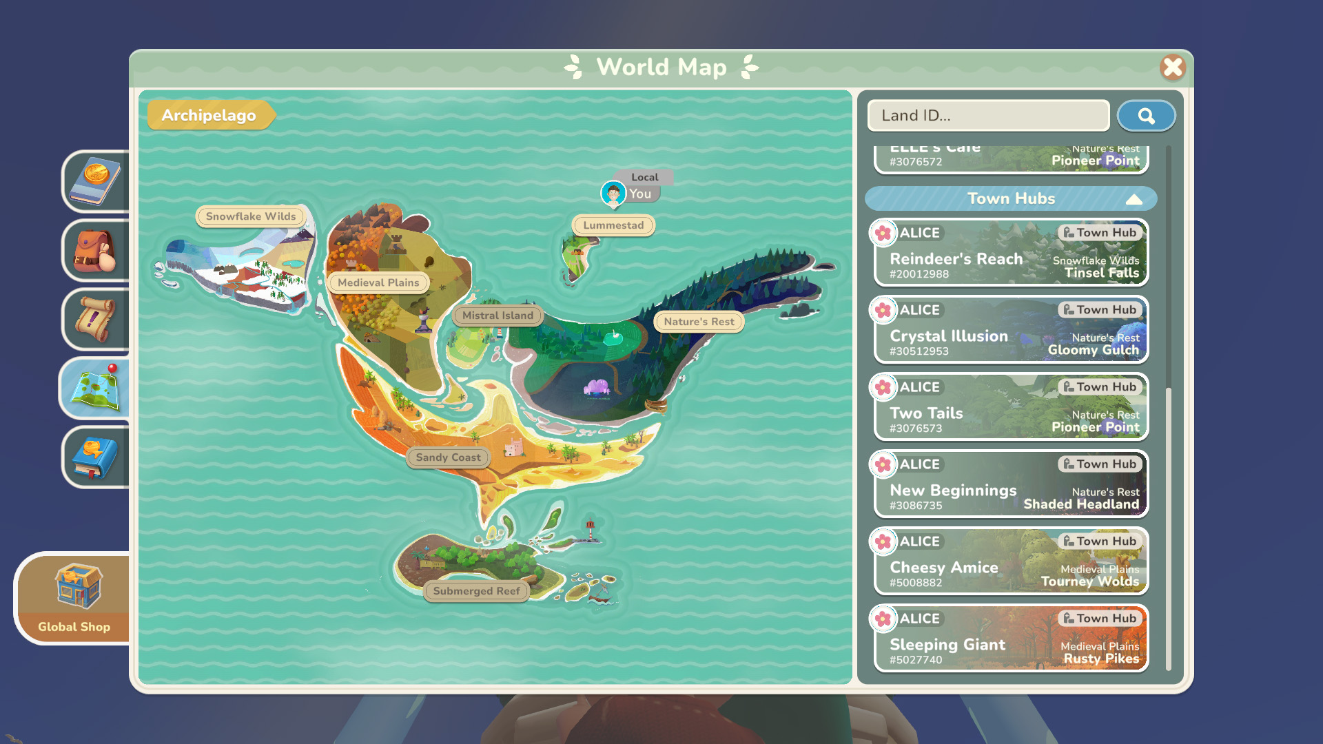


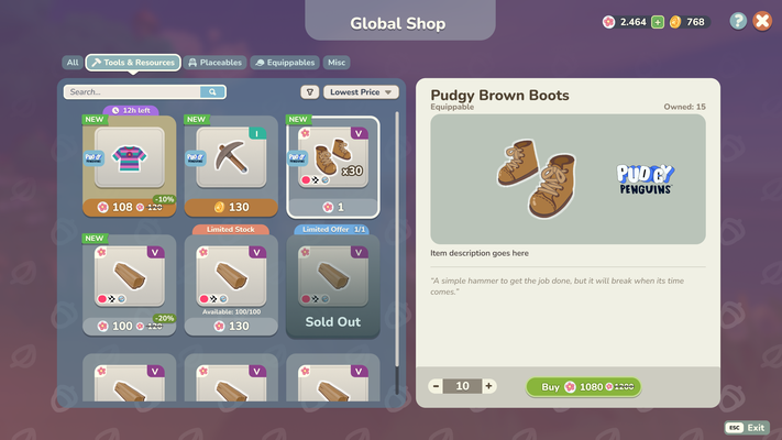
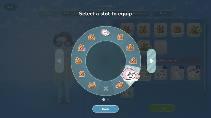
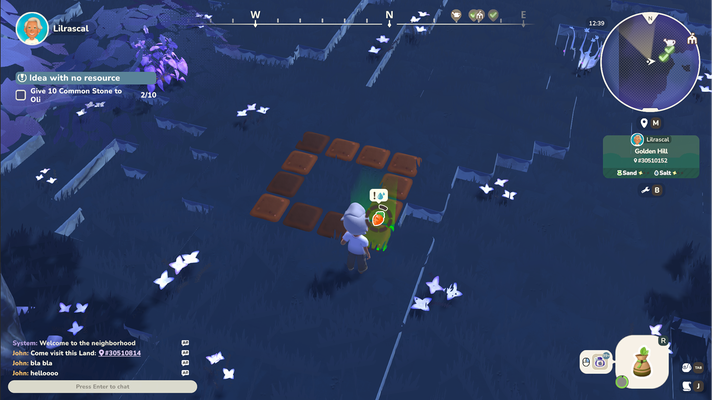
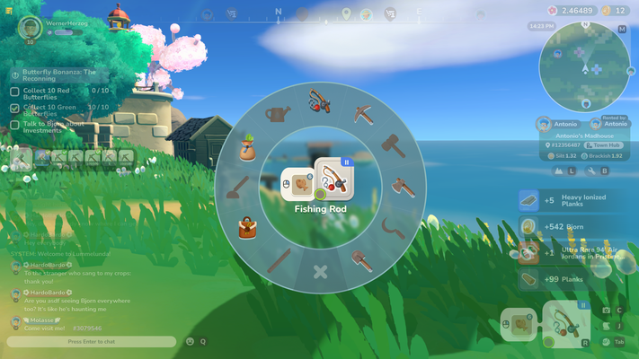
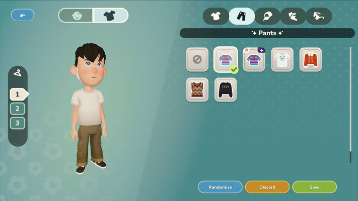
Game screenshots
Summary
Since March 2024, I have guided the My Neighbor Alice UX from Early Alpha to a successful global launch.
My role was to translate technical requirements into a scalable framework that prioritizes intuitive interaction over complexity. By establishing efficient cross-department processes, I ensured that every new feature was delivered with higher quality and less development friction.
The Results
- User Retention: By pivoting to a player-centric design approach, I successfully bridged the gap between complex backend systems and the casual end-user, leading to a measurable lift in onboarding KPIs.
- Visual Coherence: I overhauled the UI into a modular system that is accessible while supporting the game’s rapid content expansion.
- Production Efficiency: The new framework significantly reduced UI implementation time, allowing the team to roll out dozens of features without creating more tech debt.


Goals
I joined the team at a significant turning point: after three years of production focused primarily on backend technology, the project was transitioning to a new team tasked with expanding the game for a full release.
Because the visual experience hadn't been a priority yet, we had a massive library of features ready to go, but no cohesive way for players to interact with them.
I saw this as the perfect moment to step in and build a proper UI foundation from the ground up.
My goals:
-
Visual Identity: Overhaul the UI into a simple, cozy art style that complements the game's theme
-
Simplicity: Reduce the visual noise to show only what’s relevant, making the game more approachable for a casual audience
-
Gamepad-friendly: Choose solutions that allows game-pad support in the future
-
Scalable Architecture: Move away from one-off solutions and create a modular foundation for easier long-term expansion
A Moving Ship
Years of organic growth had left the UI with a fragmented technical setup with nearly every feature using bespoke assets. This made scaling almost impossible as every aspect of the UI needed additional effort.
My first priority was working with the front-end team to build a consistent UI framework from scratch which we rolled out incrementally to avoid disrupting our live update schedule. We migrated the live game to this new system update-by-update until the entire experience was cohesive.

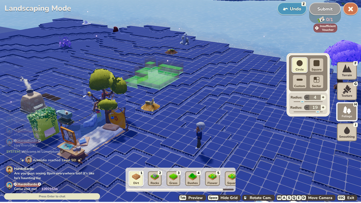
Screenshot of the Design System
With the foundation finally settled, I was able to shift my focus to the fun part: adding the unique solutions, motion design, and 'small moments of joy' that elevates the game experience.
Research
I had no prior experience with MMOs or the cozy game genre, so I started by building an extensive reference library and conducting competitor analysis to better understand the needs and expectations of the cozy mmo audience.
This competitor exploration gave me the insights I needed to design a UI that felt simple enough for newcomers to pick up and play while still offering the depth and proficiency expected by veterans of the genre.
Figma research board

With a better understanding of the competitors and genre, I started reworking the core features that would improve the existing UI and UX.
Exploration
I chose to build our UI and UX flows entirely in Figma to prioritize transparency and speed.
Moving away from static Photoshop files and buried Confluence pages meant that engineers and designers had instant visibility into the latest iterations.
This open workflow significantly reduced the feedback loop, allowing us to catch potential implementation challenges much earlier in the design phase. Having artists, designers, and engineers jump into my files to leave comments or check specs transformed how we worked together as a department.

Challenges
A primary focus throughout the project was managing the friction of the underlying blockchain technology.
My Neighbor Alice runs on a custom, cutting-edge chain where every action occurs on-chain. This presented a unique set of constraints that often contradicted traditional gaming conventions.
In a typical game, feedback is instant. On a blockchain, certain operations experience high loads and verification delays. To prevent players from being "stopped in their tracks," I designed UI patterns that managed expectations without breaking immersion.
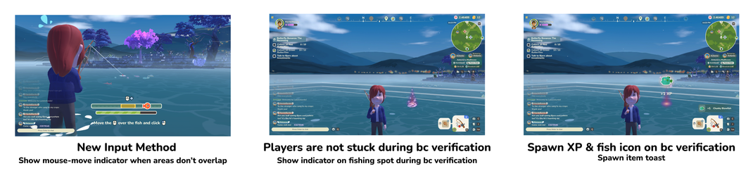
Example challenge:
The original fishing minigame had a mandatory blockchain verification step once the fishing minigame is concluded. This meant: players could not move or do anything while waiting for the blockchain to verify their transaction.
The solution:
a flexible approach that isolates the blockchain verficiation and detaches player actions from this operation.
This was realized by leaving a "pending"-state where the fish was caught, allowing the player to continue with their actions while the blockchain operation is ongoing.
Once the verification is received, the results are shown in multiple communication channels (in-world, toasts, progress bar update) to ensure players can't miss the delayed outcome.
I developed various similar systems to better communicate "pending" states for on-chain actions while allowing the player to continue their experience uninterrupted. By collaborating closely with the engineering and backend teams, we found creative ways to hide or delay these verifications, ensuring a smooth gameplay experience.
The goal was to make the technology invisible: keeping the focus entirely on the game world rather than the ledger behind it.

Branding Update
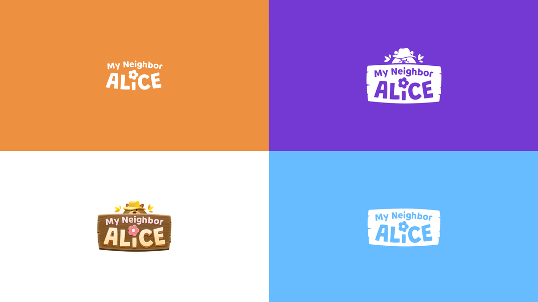
As we approached the transition from Beta to Full Release, it became clear that our branding needed to evolve alongside the game. The original logo, while charming, struggled with readability at smaller scales and had an unwieldy composition that made it difficult to use across different marketing channels.
Working closely with the Art Lead and Marketing, we set out to explore a new visual direction that is more modern and fitting to what the game has become - represented in a new color scheme, a new typeface and a new logo.
My focus was on the new typeface and the logo, where I was responsible for the approach and direction.
Thanks to Remy Chanfreau, Marius Guillemain and Oleksii Kirgizov, we've managed to deliver results in less than a month and were able to get the new direction approved and implemented in record time.

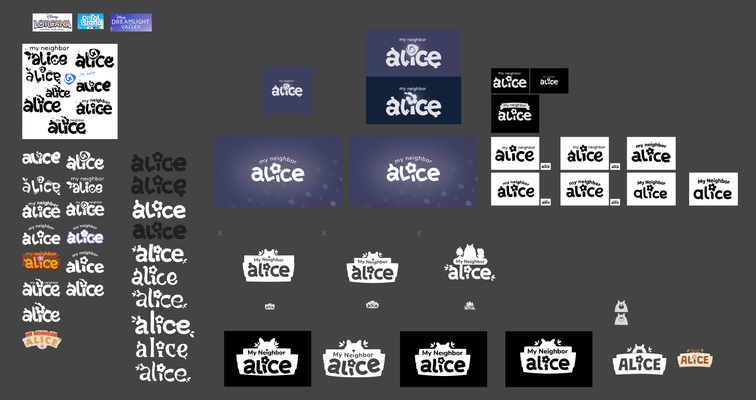
Logo Update
The main issues with the original logo were its unwieldy composition and dimensions, the lack of contrast and insufficient readability on smaller scales.
Together with the marketing artist and art director, I steered the direction for a more modern, cohesive visual identity. We explored several compositions, eventually deciding to keep the iconic "Alice Flower" as our centerpiece.
Old logo
Low contrast, complex silhouette, difficult to read on mobile

New logo
Higher contrast and readability, defined hierarchy, integrated character art, and optimized for all screen sizes and compositions
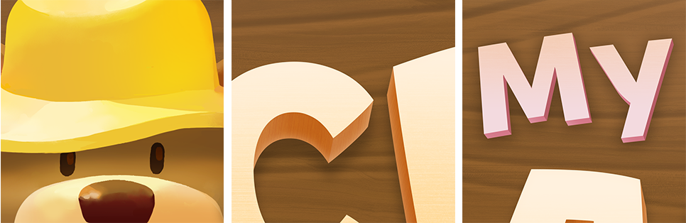
Character & Context: Early drafts felt a bit too sterile, so we introduced a simplified version of Bjorn the bear peeking out from behind a wooden panel. This small addition anchored the logo in the game's world but still felt too generic. The yellow fisherhat added a layer of personality that tied everything together.
Hand-Crafted Appeal: To avoid a "corporate" feel, the lettering was hand-drawn to ensure the brand felt playful and personal, mirroring the handcrafted watercolor aesthetic of the game itself.
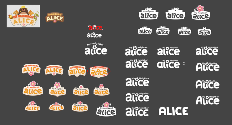
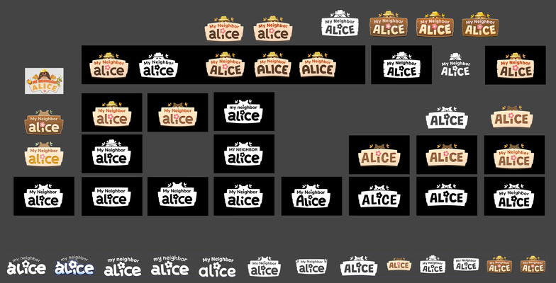
Exploration board with mockups
Logo details
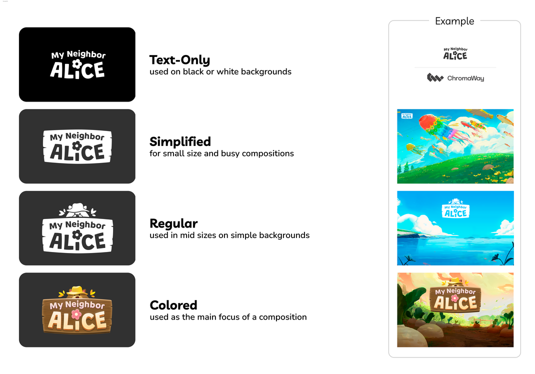
Logo variants and usage examples

A key part of this update was finding a "Hero" typeface that could handle both marketing and in-game needs. I used Figma to build rapid test environments, allowing us to see how different fonts felt in various contexts like tiny UI buttons and large-scale banners.
We eventually settled on Livvic as our primary typeface. It offers a fresh, modern look that still embraces the "cozy" vibes of the game.
It pairs perfectly with Nunito Sans, our established body font, ensuring a consistent and readable experience across the entire product.
Quality of Life: Community-driven iterations
A game’s longevity depends on how well the developers listen.
My role was to synthesize community feedback into actionable "improvement packages" that addressed player pain points while staying true to our technical roadmap. Over two years, we released dozens of features that bridged the gap between our initial Alpha vision and the needs of a live audience.
Information Density
Playing the game ourselves revealed certain friction points, but community feedback provided the real data and scope:
A recurring request was for "quicker" and more efficient information access.

The Problem: Players felt forced to click into every item to see crafting requirements (the "third layer" of info), which slowed down the gameplay loop until they've "learned" all the requirements.
The Solution: I iterated on the hover tooltips (the "second layer") to include highly contextual data, such as resource requirements. Additionally we offered a toggle to show craftable items without the need to look up the requirements.
The Result: By bringing deep data into a surface-level interaction, we satisfied the needs of power users without cluttering the UI for newcomers.
On top of that, players can toggle between items that can be crafted, makes the tooltip look-up optional.
Anticipating User Needs
In a lean team, we often focused on the Minimum Viable Product (MVP). Still, whenever possible I made it a point to mock up the full, ideal scope of a feature before stripping it back for launch.
Focusing on the MVP and exploring the full scope helped me to anticipate the player needs of the specific feature, with ideas and solutions already defined and mocked up.
This allowed us to "future-proof" our foundations. When the community inevitably requested deeper features post-launch, we already had the designs ready to go. This validated our roadmap and allowed us to respond to feedback with high speed and confidence.
Adding Delight & Expression
Not every improvement needs to be a system overhaul. Sometimes, the biggest impact comes from small touches of personality.
One example are a set of custom MNA-branded chat emojis that I had the pleasure of creating from scratch.
Recognizing that our players were heavily utilizing the chat, I collaborated with the Community Manager to design a custom set of MNA-branded emojis from scratch.
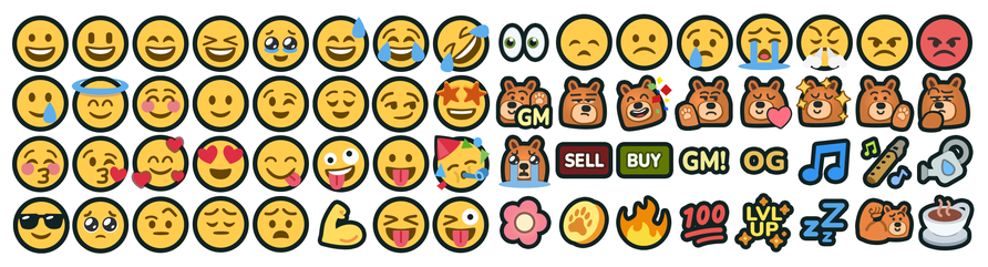
While a small technical addition, it provided a significant boost to community expression and helped reinforce the game's unique brand identity within social interactions.
For me, working on Alice reinforced that in live-service games, UI is never "finished" but it's a constantly evolving ecosystem.
Transforming the My Neighbor Alice UI from a fragmented Alpha state into a cohesive, global brand was a rewarding challenge. We successfully cleared years of technical debt, established a collaborative Figma-based workflow, and delivered a player-centric experience that improved onboarding and community sentiment.
I learned that building a flexible, modular framework early is the best way to support a game that intends to scale. By prioritizing a "system-first" approach, I ensured the team could innovate without the burden of technical debt.
I’m excited to bring these insights into my next project.
Let’s build something together.
If you’re navigating a project transition or need to scale a complex UI framework for a global audience, I’d love to chat about how my experience can help your team.
Thank you for reading!
Continue with my previous project: XCOM Legends